- Buy Crypto
- Markets
- Futures
- Spot
- Copy Trade
 Earn
Earn- More
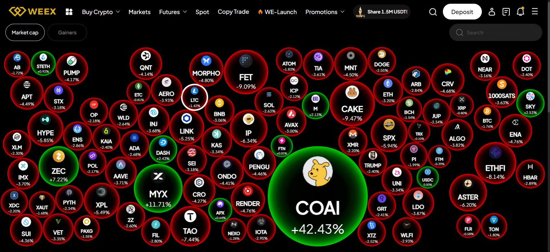
Weex Bubbles: The Ultimate Guide to Understanding and Utilizing Cryptocurrency Bubble Charts for Market Insight
I. Introduction: Translating Data Chaos into Visual Clarity
The cryptocurrency market is renowned for its high velocity, extreme volatility, and multidimensional nature. In traditional analysis, traders typically rely on line or bar charts to observe two dimensions: price (Y-axis) and time (X-axis). However, evaluating the true value and risk potential of a crypto asset requires simultaneously considering multiple factors, such as volatility, market liquidity, and instantaneous momentum. The complexity of these interacting factors means that traditional two-dimensional charts often fall short in capturing the overall market environment, leading to fragmented analysis.
There is a pressing market need for a tool that can display three or more variables on a single plane, enabling rapid identification of correlations and market anomalies. This need is precisely where the core value of bubble chart analysis lies.
What is Weex Bubbles? A Revolutionary Market Analysis Tool
Weex Bubbles is an advanced, real-time visualization platform specifically designed for the crypto market, harnessing the power of multidimensional bubble charts. The tool aims to provide a holistic market assessment through a single view, significantly exceeding the capabilities of standard charting software.
The core value proposition of Weex Bubbles is to provide instant, holistic market assessment, help users identify hidden sector rotation patterns, and enable superior risk/reward ratio analysis. By synthesizing complex market data into one dynamic, easy-to-understand interface, it allows quantitative analysts, active day traders, portfolio managers, and long-term investors seeking an advanced analytical edge to quickly grasp market structure and capital flows.
Who Can Use Weex Bubbles
The target audience for Weex Bubbles includes quantitative analysts, active day traders, portfolio managers, and seasoned long-term investors seeking an advantage through complex data synthesis.
The platform proves indispensable in several key applications: gauging market sentiment, tracking sector rotation trajectories, detecting volatility clustering, and performing rapid portfolio health checks. By simultaneously assessing risk, reward, and liquidity, users can make decisions faster than by observing price movements alone.
II. The Mechanics of Weex Bubbles: Decoding the Multidimensional Crypto Map
The bubble chart mechanism is the foundation for the deep analysis provided by Weex Bubbles. To utilize the tool effectively, users must understand the underlying mathematical and technical basis, particularly how four or even five independent market indicators are mapped to visual elements.
The Basic Dimensions of the Bubble Chart: X-Axis, Y-Axis, and Size
A bubble chart is essentially a scatter plot, but the plotted points (representing crypto assets) are replaced by bubbles, allowing a third dimension of data to be represented by the bubble's area (size).
The X-Axis of the Bubble Chart: Expressing Risk and Context
The horizontal axis (X-axis) provides the context of the measurement. In FinTech applications, the X-axis typically represents a continuous numerical value related to risk (e.g., 24-hour volatility, Beta coefficient) or a specific date/time field.
In Weex Bubbles, by mapping risk indicators like volatility to the X-axis, analysts can instantly assess the asset's risk level relative to others on the screen. Low-volatility assets reside on the left, and high-volatility assets on the right, providing an immediate basis for risk assessment.
The Y-Axis of the Bubble Chart: Key Metrics (e.g., Price Change)
The vertical axis (Y-axis) almost always represents numerical values, typically signifying the asset's performance or potential return (e.g., 7-day price change, ROI, or P/E ratio equivalents). This field often supports aggregation methods such as Sum, Average, Minimum, or Maximum.
Placing performance metrics on the Y-axis allows users to quickly gauge potential returns. For instance, setting the "7-Day Price Change Percentage" on the Y-axis helps in directly ranking assets by return potential, which is crucial for the strategic quadrant analysis discussed later.
Bubble Size: Representing Market Weight or Volume (The Third Dimension)
Bubble size is the most visually dominant dimension and is critical for representing market influence and liquidity (e.g., Market Capitalization or Total Trading Volume). A larger bubble generally implies higher liquidity, a more significant market position, or greater market exposure.
Since size often represents trading volume or market cap, the underlying numerical field must be correctly aggregated. For volume over a period, the "Sum" aggregation must be used; for market cap, the current market cap data is used. Incorrect aggregation renders this dimension analytically useless.
Dynamic Dimensions: Color and Movement
The analytical value of the bubble chart is not limited to these three basic dimensions; the fourth and fifth dimensions are introduced through color and real-time movement.
Color Code: Interpreting Momentum and Direction (The Fourth Dimension)
Color provides immediate directional or qualitative data. Traditionally, green represents positive short-term momentum (e.g., price increase over the past 4 hours or high net buying volume), while red represents negative momentum.
Weex Bubbles may allow users to customize color mapping to represent qualitative metrics, such as an overall sentiment score or fundamental health rating, thereby acting as a layer of categorical data.
Bubble Movement: Real-Time Analysis and Time Series (The Implicit Fifth Dimension)
While real-time movement is not a standard chart dimension, the trajectory of a bubble's movement across the X/Y plane is the source of the most advanced insight in analysis: market rotation. Observing a bubble rapidly moving from the "Low Volatility/High Return" quadrant to the "High Volatility/Low Return" quadrant over a set time frame signals a rapid deterioration of the asset's market condition. By observing dynamics, Weex Bubbles offers not just a market snapshot but a "movie" of capital flows, significantly enhancing advanced analytical capabilities.
Data Scaling and Readability Enhancement
Crypto trading volumes and market capitalization often involve billions or even trillions of dollars, making raw data points difficult to manage.
Successful FinTech visualization tools must implement automatic scaling and formatting, such as representing values in thousands (K), millions (M), or billions (B) units. This requires applying scale factors (e.g., -3 to represent values in thousands) and currency formatting. This scale management is essential for improving user experience and reducing cognitive burden.
For metrics like market cap, the magnitude difference between the largest and smallest assets can be enormous. To prevent small bubbles from becoming completely invisible, Weex Bubbles must offer the functionality for logarithmic scaling of the size dimension. This technical detail determines the tool's practical usability.
The table below summarizes the standard dimension mapping for Weex Bubbles in crypto analysis.
Table 1: Standard Dimension Mapping for Weex Bubbles Crypto Analysis
| Chart Element | Typical Crypto Metric | Numeric Interpretation | Underlying Data Type |
| X-Axis (Horizontal) | 24-Hour Annualized Volatility (%) | Market Risk Level; Price Dispersion | Numerical |
| Y-Axis (Vertical) | 7-Day Price Change (%) | Asset Performance/Return | Numerical (Aggregated) |
| Bubble Size | Fully Diluted Market Cap (USD) | Market Influence and Liquidity | Numerical (Scaled, Sum/Current) |
| Bubble Color | Current Hour Price Trend | Immediate Direction/Momentum | Categorical (Green/Red/Neutral) |
III. Getting Started with Weex Bubbles: Interface and Initial Configuration
Understanding the principles of the bubble chart, the next step is mastering the operational process, especially how to correctly configure parameters to yield strategic analytical results.
Account Setup and Navigation
Users first need to access the bubble chart interface via the dedicated product link provided by Weex (e.g., https://www.weex.com/crypto-bubbles).
The Weex Bubbles interface typically consists of three main areas: the Control Panel (left or top, for selecting time frames, filters, and metrics), the Visualization Area (the central dynamic X/Y grid where bubbles appear and move), and the Legend and Data Table (bottom or right, providing color code mapping, and detailed data when hovering over or clicking a single asset).
Setting Up the First Bubble Chart: The Volatility/Performance Grid
To conduct effective analysis, data must first be filtered to reduce noise. Users need to learn how to use filtering functions, such as excluding stablecoins, filtering by minimum market cap (e.g., above $100 million), or limiting to specific sectors (DeFi, Layer 1, Meme coins, etc.).
Users also need to define the time frame. This involves two key concepts: the aggregation period (e.g., calculating 24-hour volume) and the display refresh rate (e.g., updating every 5 minutes). These two must be clearly distinguished.
Selecting Core Parameters: Inputting X, Y, and Size Metrics
Users must assign metrics step-by-step: for instance, assigning "24-Hour Volatility" to the X-axis, while ensuring its scale is appropriate.
Aggregation selection is a critical step. For trading volume, "Sum" must be selected; for volatility, "Average" or "Standard Deviation" is typically chosen. Incorrectly applying the aggregation type (e.g., using "Average" for trading volume) will distort the analytical data, especially when measuring liquidity.
Customization and View Saving
Weex Bubbles allows users to fine-tune their analytical views. Users can learn to manually override automatic scaling features, such as changing currency symbols or defining custom numerical ranges to focus on specific market segments.
Furthermore, to achieve efficient daily analysis, users should save specific combinations of asset filters, time frames, and dimension mappings as reusable templates (e.g., "Defensive Portfolio View," "Momentum Catcher View").
The table below shows some recommended parameter settings for advanced strategic analysis.
Table 2: Recommended Parameter Settings for Advanced Strategic Analysis
| Parameter Category | Recommended Setting | Metric Type | Strategic Goal |
| Asset Filter | Top 100 Assets by Market Cap | Categorical | Reduce noise; focus on highly liquid trading opportunities. |
| X-Axis Metric | 30-Day Sharpe Ratio | Numerical (Average) | Measures risk-adjusted return (Superior to pure volatility). |
| Y-Axis Metric | 48-Hour Net Inflow (Exchange In/Out) | Numerical (Sum) | Measures immediate capital commitment/exodus. |
| Bubble Size Metric | Total Trading Volume (Last 7 Days) | Numerical (Sum, Scaled K/M/B) | Confirms liquidity and the ability to enter/exit positions easily. |
IV. Advanced Application: Interpreting Patterns and Formulating Trading Strategies
The true power of Weex Bubbles lies in its interpretative capability, particularly the analysis of the four strategic quadrants and the real-time tracking of market rotation.
Identifying Market Rotation and Capital Flows
The "Clustering Effect"
When multiple bubbles representing the same sector (e.g., GameFi tokens or Layer 2 solutions) cluster together on the chart, it indicates a strong thematic force driving that sector, potentially overriding the fundamentals of individual assets.
Monitoring Sector Rotation (Thematic Capital Flow)
Tracking sector rotation is one of the most valuable signals gained through Weex Bubbles. Analysts need to observe the trajectory of the bubble clusters over time. If the DeFi bubble cluster shrinks in size and moves downward (underperformance), while the Layer 2 bubble cluster increases in size and moves toward the top-right (higher volatility/higher return), it strongly suggests that capital is rotating from the DeFi sector into the Layer 2 sector. This dynamic observation provides powerful allocation signals for portfolio managers.
Strategic Focus: Volatility and Performance Analysis (The Four Quadrants)
For quadrant analysis, a prerequisite must be set: the X-axis is Volatility (low risk on the left, high risk on the right), and the Y-axis is 24-Hour Price Change (negative return on the bottom, positive return on the top). The midpoint (0,0) of the X and Y axes represents the market median.
Stable Growth Quadrant (Low Risk, High Return: Top-Left)
Interpretation: Assets located here show strong performance (high Y-axis) but relatively low volatility (low X-axis). In a healthy uptrend, these are often established, fundamentally strong assets. They represent potentially safer long-term positions.
Action: These assets are ideal candidates for core, sustained portfolio holdings. Their stability combined with growth potential indicates high-quality capital allocation.
High Risk/High Return Quadrant (Top-Right)
Interpretation: These assets exhibit high performance, but with accompanying high volatility. They are usually newer, fast-moving assets (e.g., new Layer 2 launches or high-beta tokens). Their high volatility itself may be caused by their rapid price appreciation.
Action: They are opportunities for short-term momentum trading. Strict risk management is required due to the inherent volatility. Here, bubble size (liquidity) is crucial—large bubbles entering this quadrant may foreshadow elevated speculative sentiment in the entire market.
Dormant Value Quadrant (Low Risk, Low/Negative Return: Bottom-Left)
Interpretation: Assets are underperforming, but volatility is stabilizing. These might be dormant giants, undervalued assets, or assets that have completed capitulation.
Action: If a potential catalyst can be identified, these assets may represent deep value opportunities. If performance is close to zero, they could also be stablecoins or flight-to-safety assets.
Danger Zone Quadrant (High Risk, Low/Negative Return: Bottom-Right)
Interpretation: Asset value is rapidly draining while exhibiting extreme market instability. This strongly indicates market panic, de-pegging risk or project failure.
Action: Upon discovering such assets, liquidation must be performed or shorting opportunities considered (if size/liquidity allows). The primary task is risk avoidance. If a large bubble (high liquidity) rapidly slides into this quadrant, it often triggers market contagion, indicating systemic risk.
Real-Time Monitoring and Alert Configuration
The dynamic nature of Weex Bubbles supports setting up crucial trigger alerts. For example, the system can provide a notification when a bubble crosses a predefined boundary (such as an asset moving from the "Stable Growth" quadrant to the "High Risk" quadrant).
Analysts should learn to use the tool during macroeconomic events (e.g., Fed announcements, regulatory news). By observing the speed and direction of bubble movement, Weex Bubbles allows users to visually confirm which market sectors are absorbing or reacting most violently to external shocks, enabling rapid position adjustments.
V. Maximizing Weex Bubbles: Best Practices and Troubleshooting
Data Quality, Source Reliability, and Latency Checks
The accuracy of the bubble chart is directly dependent on the reliability of the underlying price and volume data. The Weex platform typically sources data from tier-one exchanges to ensure high fidelity.
Since cryptocurrency data is high-frequency, Weex Bubbles must minimize latency. Best practices require users to confirm the refresh timestamp displayed on the interface, ensuring the analysis is based on the latest market state.
FAQs
Why is my bubble chart blank or showing inaccurate sizes?
Troubleshooting: Check the asset filters to confirm that the minimum market cap setting is not too high. More critically, ensure that the aggregation settings are correct. For example, if you try to use "Average" aggregation for a metric that should be summed (like trading volume), the chart size will be severely distorted.
How can I compare two different time frames simultaneously (e.g., 24-hour vs. 7-day)?
Solution: If the platform supports a multi-view layout, you can open two views simultaneously. If not, a creative approach is to assign one time frame to the X-axis metric (e.g., 24-hour volatility) and the other time frame to the Y-axis metric (e.g., 7-day price change). This is an effective alternative for visualizing two time periods in a 3D space.
What is the data refresh frequency of Weex Bubbles?
Core metrics (price, volume) typically update every 5 to 15 seconds. Calculated aggregated metrics (e.g., 24-hour volatility) may refresh once per minute to maintain the timeliness and relevance of the analysis.
Optimizing Bubble Chart Visuals for Reporting and Sharing
For users who need to use Weex Bubbles for external reports or presentations, it is important to know how to export high-resolution images or embed dynamic views into external documents. Maintaining visual clarity is crucial for conveying complex market narratives.
VI. Conclusion: The Future of Cryptocurrency Visualization
Weex Bubbles is an indispensable, modern crypto trading tool. It surpasses traditional linear analysis models by offering synthetic data analysis (considering multiple variables simultaneously). The platform allows seasoned traders to transition from fragmented data points to a complete and actionable market snapshot.
Weex Bubbles' value lies in its ability to simplify complexity: it translates technical requirements (such as correct numerical aggregation and large-scale data scaling) into intuitive visual signals. This allows users to focus their energy on interpreting the trajectory and quadrant position of the bubbles on the chart, thereby quickly grasping market sentiment and capital flows.
We recommend that all users register and explore the advanced parameter settings, particularly the aggregation options, and immediately begin monitoring the key strategic quadrants to gain a clear competitive advantage in the crypto market. Weex Bubbles empowers traders with the visual edge to navigate complex market structures.
You may also like

PIKZ AI Coin Price Prediction & Forecasts for January 2026 – Could It Surge Post-Launch?
PIKZ AI Coin has just hit the market, launching on Ethereum today, January 14, 2026, at around 2:00…

FOGO Coin Price Prediction & Forecast for January 2026: Can This New Layer 1 Surge Past $1?
FOGO Coin has burst onto the scene as a fresh Layer 1 blockchain, launching just days ago on…

Fractal Bitcoin (FB) Coin Price Prediction & Forecasts for January 2026: Could It Surge 25% Amid Scaling Innovations?
Fractal Bitcoin (FB) Coin has been making waves in the crypto space as a innovative scaling solution for…

AnchorX (AxCNH) Coin Price Prediction & Forecasts for January 2026 – Could It Rebound After Recent Dip?
AnchorX (AxCNH) Coin, tied to the Conflux ecosystem on the CFX eSpace mainnet, has been making waves since…

What is Frax (FRAX) Coin?
With Frax (FRAX) now listed on WEEX, investors have another compelling option to explore in the DeFi space.…

FRAX Coin Price Prediction & Forecast: Could It Surge 25% in January 2026?
FRAX Coin, the native gas token of the Fraxtal blockchain, has been making waves in the DeFi space…

CRYPGPT Coin Price Prediction & Forecasts for January 2026: Potential Rally Amid AI Crypto Boom
CRYPGPT Coin has been turning heads in the crypto space lately, especially after its listing on platforms like…

HEIMA USDT Perpetual Contract Listed on WEEX Futures
Trade HEIMA USDT on WEEX Exchange. The new HeiMa (HEIMA) Coin perpetual contract is now live with leverage. View HEIMA crypto listing details and start trading.

WEEX Futures Launches Life K-Line Perpetual Contract with KLINE USDT Pair
WEEX Futures lists Life K-Line (KLINE) Coin with KLINE USDT perpetual contract. Trade the new Life K-Line futures with high leverage on WEEX Exchange today.

What is Crying Horse (哭哭马) Coin?
The recent Crying Horse (哭哭马) Coin listing on WEEX marks another exciting addition to the meme token market.…
CharacterX (CAI) Coin Price Prediction & Forecasts for January 2026: Could It Surge 50% Amid AI Sector Growth?
CharacterX (CAI) Coin has been turning heads in the crypto world since its launch on January 12, 2026,…
哭哭马 Coin Price Prediction & Forecasts for January 2026: Could This New Meme Token Surge After Launch?
As a seasoned crypto investor who’s traded through multiple bull and bear cycles, I’ve seen meme coins like…
老子 Coin Price Prediction & Forecasts for January 2026: New Meme Token Surges 50% Post-Launch
As a fresh entrant in the meme coin space, 老子 Coin has quickly grabbed attention since its debut…
PlusMore (PLUS) Coin Price Prediction & Forecasts for January 2026 – Could It Surge 50% Amid AI Rewards Boom?
PlusMore (PLUS) Coin, a fresh entrant in the crypto space, just launched on January 9, 2026, and it’s…
DeepNode (DN) Coin Price Prediction & Forecasts for January 2026: Surging 17% Amid AI Crypto Boom
DeepNode (DN) Coin has been turning heads in the crypto space after a sharp 16.61% spike in the…

What is B SOL (BSOL) Coin?
The crypto market has recently welcomed a fresh entrant on WEEX: B SOL (BSOL). Listed on January 13,…

BSOL (B) Coin Price Prediction & Forecasts for January 2026: Could This Meme Token Surge Amid Solana’s Hype?
As a seasoned crypto investor who’s traded through multiple market cycles, I’ve seen meme tokens like BSOL (B)…

Introducing CharacterX: Complete Guide to $CAI and Airdrop Opportunities
CharacterX, powered by the CAI Protocol, stands at the forefront of decentralized AI innovation, delivering a robust infrastructure for uncensored, AI-driven character interactions and autonomous agents. Learn its tokenomics, ecosystem impact, and how to claim free tokens in the WEEX $50,000 $CAI airdrop until Jan.19 2026!
PIKZ AI Coin Price Prediction & Forecasts for January 2026 – Could It Surge Post-Launch?
PIKZ AI Coin has just hit the market, launching on Ethereum today, January 14, 2026, at around 2:00…
FOGO Coin Price Prediction & Forecast for January 2026: Can This New Layer 1 Surge Past $1?
FOGO Coin has burst onto the scene as a fresh Layer 1 blockchain, launching just days ago on…
Fractal Bitcoin (FB) Coin Price Prediction & Forecasts for January 2026: Could It Surge 25% Amid Scaling Innovations?
Fractal Bitcoin (FB) Coin has been making waves in the crypto space as a innovative scaling solution for…
AnchorX (AxCNH) Coin Price Prediction & Forecasts for January 2026 – Could It Rebound After Recent Dip?
AnchorX (AxCNH) Coin, tied to the Conflux ecosystem on the CFX eSpace mainnet, has been making waves since…
What is Frax (FRAX) Coin?
With Frax (FRAX) now listed on WEEX, investors have another compelling option to explore in the DeFi space.…
FRAX Coin Price Prediction & Forecast: Could It Surge 25% in January 2026?
FRAX Coin, the native gas token of the Fraxtal blockchain, has been making waves in the DeFi space…